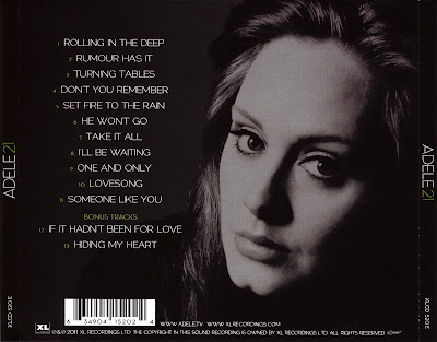
After completing my front cover conventions for the digipak, I am now going to move on to look at back covers of album covers to see their conventions to help me when creating my own. I have found out that the back cover is very similar to the front cover regarding the colours that are used as they are carried on throughout the whole album cover. What I have found from typical conventions of back covers are;
- The name of the artist at the top of the back cover to make it stand out and known
- A list in order of the songs of how they are played off the CD.
- Barcode at the bottom whether this is going to be in the middle, right or left side of the back cove(as each different back cover vary).
- The date it was released and published
- Record label logos/names
From completing research on front/back covers, I have decided that I want my digipak to have the same look as Adele 21 album cover as this shows a lot of emotion through just the cover which is very powerful. As well my music video has a lot of black and white shots where my actress is having a bad time and is very negative. I feel that creating my album cover to match this will be very effective.


No comments:
Post a Comment