Monday, 9 March 2015

Colours and titles fonts for poster and digipak

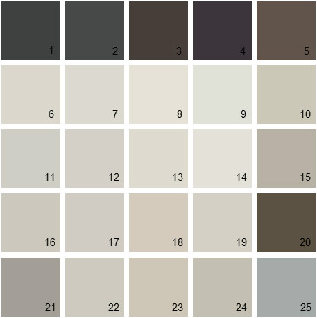
To make sure that both my poster and digipak look as professional as I can, I feel that considering what colours to use for both of these are important. So I have started off by looking at what colours I think would go best together to also relate back to my song as well. Below are a smokey set of colours which I think would work very well together on a poster for then narrative of my music video. From using colours that reflect the song will give it a whole new meaning rather then for example bright colours for a very upsetting dull song or the other way around. I have gathered different fonts together to see which one is best for both my digipak and my poster. I will gather peoples feedback to make sure I make the correct decision.

Sunday, 8 March 2015

Band/song name

When thinking of a name that I want to call my song, it took lots of decision making to makes sure that the name I choose fits for the narrative of my song and fits my actress. My music video is mainly about a girl that was with her boyfriend however then he splits up with her and then he gets a new girlfriend and she turns out to become very depressed by drinking and taking drugs. From knowing my narrative I need to make sure that I put together a good song name to make sure they actually link together. A few idea that come to mind as soon as I think of my narrative and actress are 'together again', 'good n gone', 'recovery', 'fading away' as they are all to do with love and love loss which my song is about. I have finally chosen to go with 'good n gone' as my song name.

Thursday, 5 March 2015

Ancillary Text 2: Poster research and inspirations

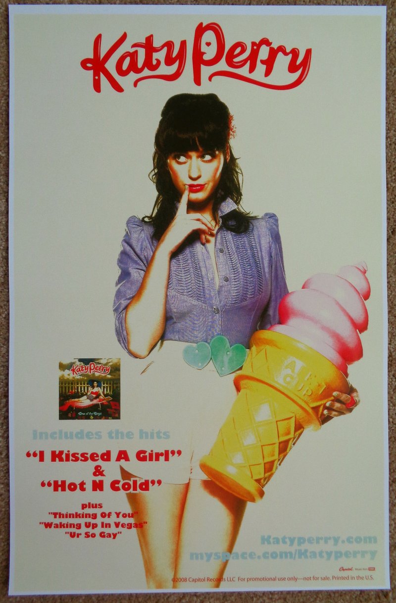
From looking at existing posters from artists within the same genre as my music video, I have been looking at their conventions of these to make sure that I use them in my own poster to make it look as realistic as possible. All of these posters below as either close ups or long shots, these are the two type of shots that I would want to use for mine. From looking at these real existing posters I have now come to the conclusion that I would like to use a long shot of my actress to reflect emotion due from her body language like which is very clear from these poster I have chosen to look at as part of my research.

Tuesday, 24 February 2015

Back cover conventions for digipak

Back cover conventions for digipak
After completing my front cover conventions for the digipak, I am now going to move on to look at back covers of album covers to see their conventions to help me when creating my own. I have found out that the back cover is very similar to the front cover regarding the colours that are used as they are carried on throughout the whole album cover. What I have found from typical conventions of back covers are;
  • The name of the artist at the top of the back cover to make it stand out and known
  • A list in order of the songs of how they are played off the CD. 
  • Barcode at the bottom whether this is going to be in the middle, right or left side of the back cove(as each different back cover vary).
  • The date it was released and published
  • Record label logos/names


From completing research on front/back covers, I have decided that I want my digipak to have the same look as Adele 21 album cover as this shows a lot of emotion through just the cover which is very powerful. As well my music video has a lot of black and white shots where my actress is having a bad time and is very negative. I feel that creating my album cover to match this will be very effective.

Existing digipaks


Below are examples of existing digipaks that have been created. Hopefully after all of my research and planning my own digipak will be similar to the professional style that I have been researching. From looking at existing digipaks that are currently already out, I will be able to see the different conventions that have been used so that I know to make my similar to these to make my own album cover similar as possible to look as realistic as possible.
This is Rhiannas - Loud digipak album cover. Loud is Rhiannas 5th studio album and was released by Def Jam records on November 12th 2010. I have chosen to look at this existing digipak for ideas for my own digipak for my own music video. I am looking at Rhiannas because it is in the same genre as Beyonce, which my song is. I think the digipak for this album represents Rhianna is a way that her personality is herself which is very pretty. Red is associated with sex, love, desire and power therefore this reinforces what her songs are about. Red is a very sexual colour therefore this will appeal to her ale target audience. Here I want to have the same ideas to use for my own digipak. Your attention is drawn to her red lips and her red hair. This digipak appeals to all of her intended audience in many different ways which I want mine too as well. The text is also very simple, the white against the res and Rhiannas skin tone works very well and makes it stand out and makes it visible to a buyer when looking at the album cover in supermarkets or CD stores.

I also have been looking at Adele - 21 Album cover as it is very much how I want my own digipak, I want to use the same colours as Adele has for her own digipak as most of my music video is in black and white. With both of these digipaks that I have researched I want to use a close up for my own as I feel that if I use a close up, it is filled with emotions which my music video is. 
 

Front cover conventions for digipak

Front cover conventions for a digipak
First of all I have started to look at the typical conventions of a front cover of an album cover. This will again help me make mine look as realistic as possible if I know what needs to be included in my own when I am making it. I was looking at this certain front cover of Bruno Mars album cover doo-woops and hooligans. I found that this front cover was very simple however very effective as it challenged conventions. 
  • A main image - The main image is very important for the front cover of the digipak as this is what the audience/buyers first see when it is on the shelves of supermarkets and CD shops. This will represent the artist or band from their photo that has been used for this front cover.
  • Artists name - The artists name is also very important so that the audience/buyers know who's CD they are purchasing. This is needs to be bold and clear on the front cover. 
  • Album name - Is the same as the artists name. It again needs to be bold and clear to the audience/buyers.
  • Logo - A individual logo for the album cover would be needed to make it different from every other album cover that is out