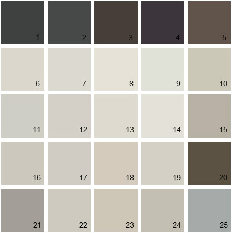
To make sure that both my poster and digipak look as professional as I can, I feel that considering what colours to use for both of these are important. So I have started off by looking at what colours I think would go best together to also relate back to my song as well. Below are a smokey set of colours which I think would work very well together on a poster for then narrative of my music video. From using colours that reflect the song will give it a whole new meaning rather then for example bright colours for a very upsetting dull song or the other way around. I have gathered different fonts together to see which one is best for both my digipak and my poster. I will gather peoples feedback to make sure I make the correct decision.


No comments:
Post a Comment